The rebranding of an engineering software company, and the entire marketing operation that now runs on it.
AltoQi was founded in 1989. That is 37 years of engineering software, and a brand that aged along with us without ever being rebuilt. Repositioning a company of this age isn't about starting from scratch: it's about preserving what the market already recognizes while replacing everything that has been left behind.


Viewed from the front, nine equilateral triangles make up the symbol. In three dimensions, the structure reveals a mathematical relationship where the smallest part supports the largest, creating a precise balance—an idea that says more about engineering than any adjective could.
When presented to the founders, the shape was described by one of them as “astonishing.” The word comes from the Latin *ex tonare*, to thunder, and reaches Portuguese as *atônito* (stunned): one who is struck by thunder. It doesn't describe the piece; it describes what happens to those who see it.
Inspired by the Vitruvian concept of architecture and the triangle—the most rigid and stable geometric shape—the new brand incorporates isometric grids and establishes guidelines for functional, systemic, and iconic communication.
The products were restructured into a monolithic architecture, incorporating the master brand into their own names. Inspired by Escher, Mano Pimentel from Estúdio Pimp developed a three-dimensional alphabet. A collaboration with John from Firmorama resulted in an algorithm to generate artwork for new brands and products, as well as a package of visual assets.


3D animation by Estúdio Pimp and sonic identity by Maestro Billy come together in the full brand expression. Alongside is the launch film produced in-house, with a script by the team of experts and coordination by Ricardo Peruchi.
The new branding took shape at Feicon 2022, where we reinvented the booth experience. The traditional header from previous years was replaced by an L-shaped 3D screen, creating an immersive visual experience. The motion content highlighted software solutions and key business areas, and is what plays in the background of this section.
The sonic identity was created by Maestro Billy, combining artificial intelligence and binaural audio. Each product received 3D animated vignettes and exclusive sonic branding, with the signature extending to hold music and audiovisual content tracks—consistency across touchpoints that almost no one designs for.
A design system was developed in Figma using the Atomic Design method, becoming the central tool for the communications and marketing teams. It supports the production of approximately 400 assets per month—including posts, ads, articles, internal communications, e-books, videos, and podcasts—ensuring visual consistency and operational efficiency.
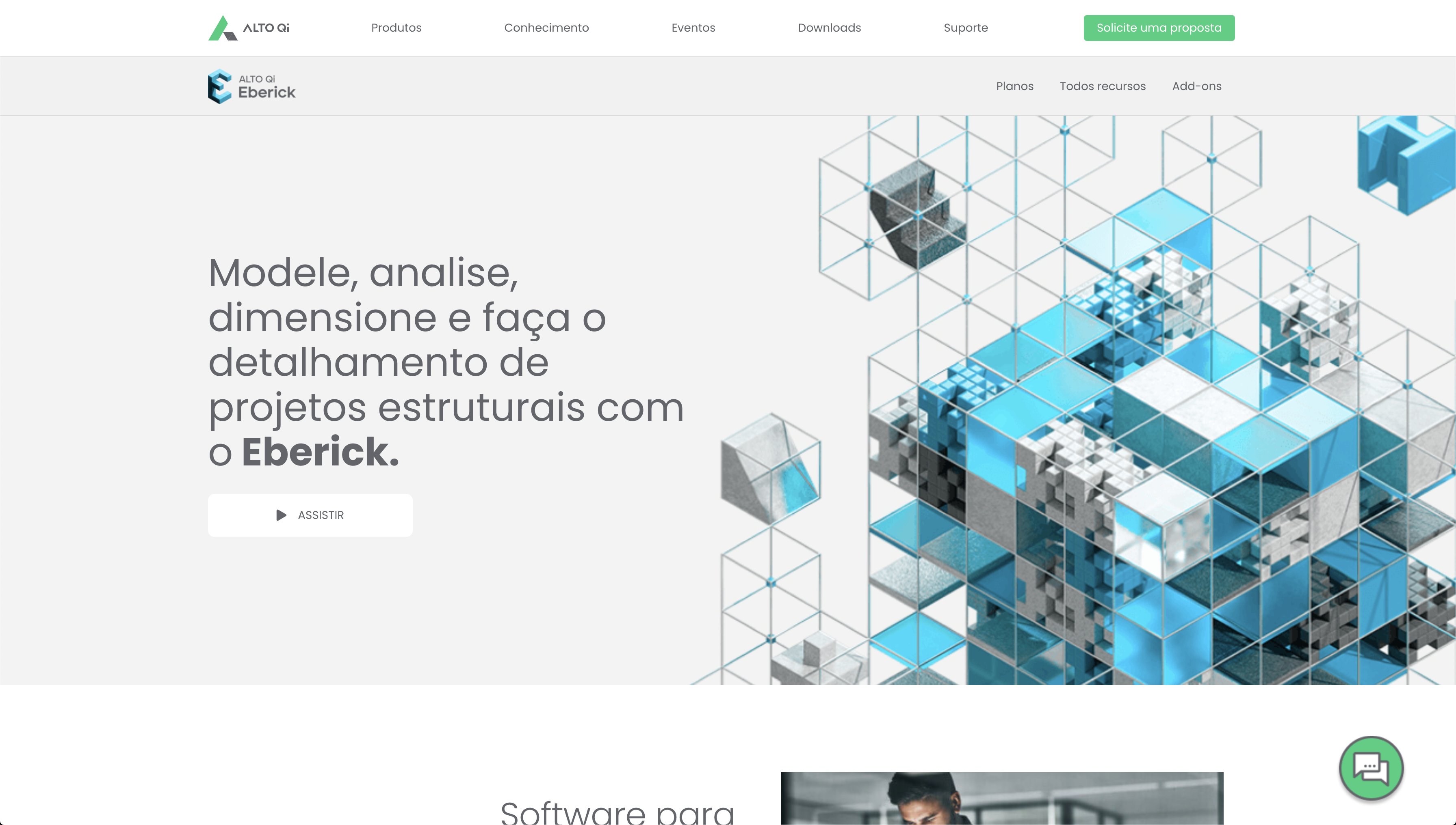
The new website was built with Next.js, using a custom design system in Figma and reusable components. The internal team also produced the product guide: feature battlecards, copywriting benchmarks, and a guide to market-perceived attributes.
A new brand without an operation to support it is just a pretty presentation. The system is what makes a rebranding survive past the second month.
Built with Next.js for high performance, featuring a custom design system in Figma and reusable components that allow the interface to evolve without rebuilding the foundation.

Eberick, Builder, Visus, and Cloud received 3D animated bumpers and exclusive sonic branding, reinforcing each one's personality within the brand's monolithic architecture.
Created by Maestro Billy using a combination of artificial intelligence and binaural audio, the sonic identity extends from the main signature to hold music and content soundtracks.
AltoQi started as a rebranding project and evolved into a design system, sonic branding, a Next.js website, product films, and a commercial guide, because an identity only truly exists when the operation can produce it every single day. That is where Lemonade’s consulting meets brand work: in what happens after the presentation.